


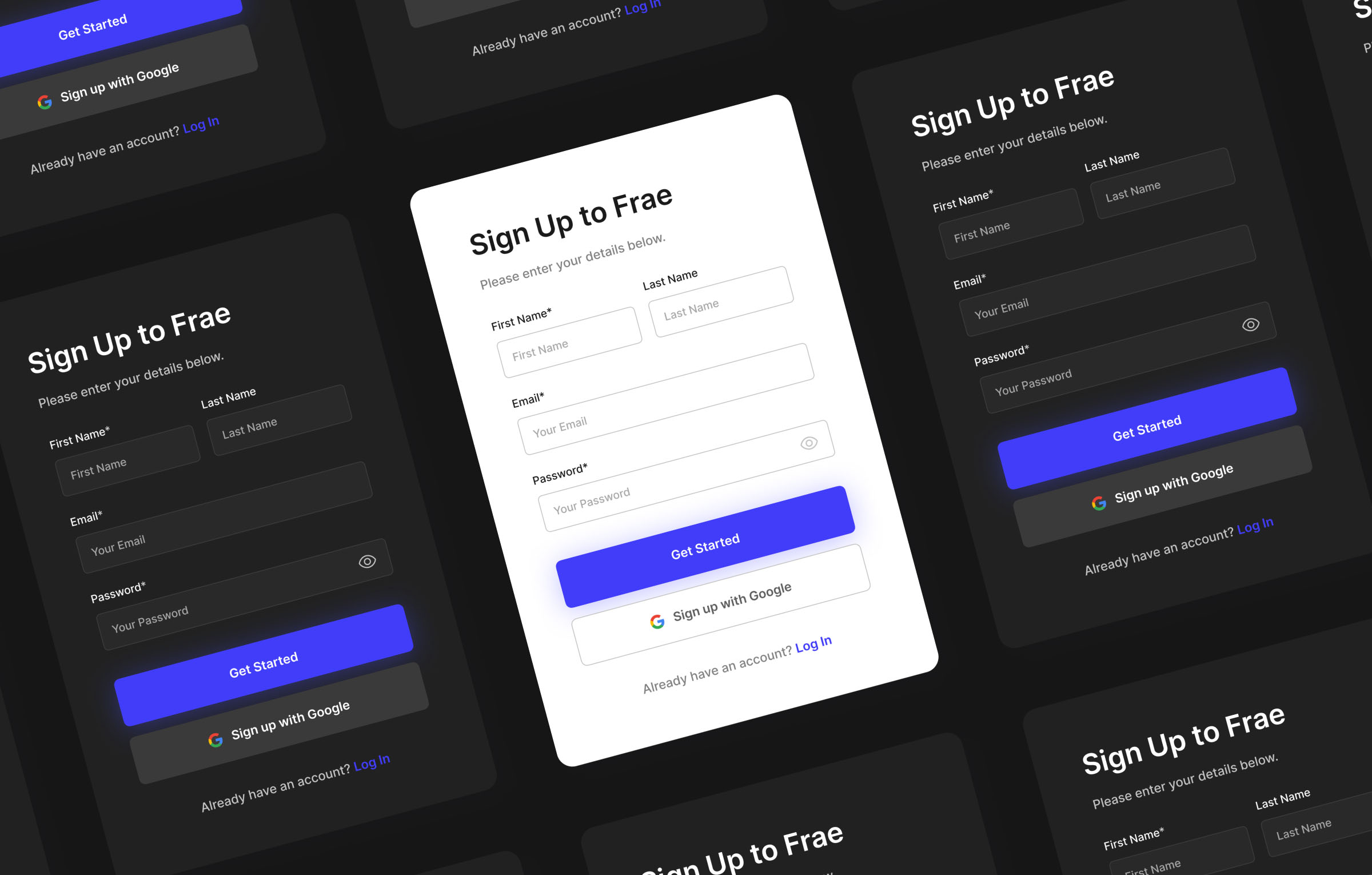
So.. what are we making?
Creating a form designing Figma is a simple process. With autolayout, you can create a responsive from with multiple rows and columns in minutes!
In this tutorial we are going to be making a simple sign up form. The skills learned here will allow you to create responsive forms that you can use across many different applications in your designs.

Responsive Magic!
The way we are designing this form will allow us to change its content and formatting with ease! We can re-size it to fit any width, rearrange fields and even adjust the amount of columns we have.
Step One: Creating the first field
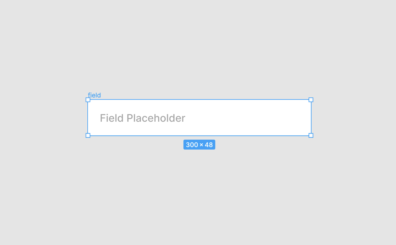
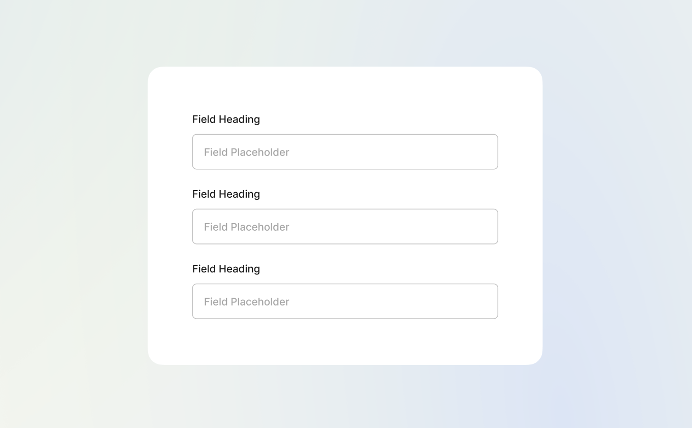
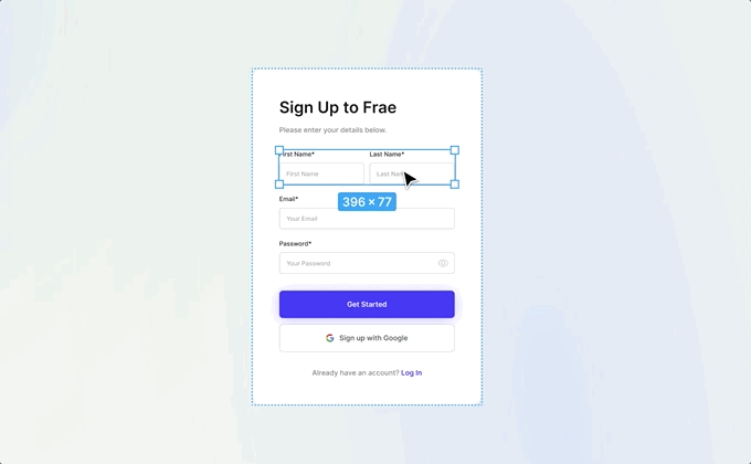
For the first step we are going to be creating the first field. This field will be become a component that we will duplicate for all of our fields! Select the text tool from the Figma toolbar and write out "Field Placeholder". For this example I chose Inter as our font, 14px, medium weight and a fill of #A7A7A7.
After you have created this text, right click and select "Auto Layout". This will create an auto layout frame, which we will name "field". We give this new auto layout frame a fill of #FFFFFF, a 1px stroke of #C2C2C2, a corner radius of 6px, and fixed height of 48px.
Under the auto layout menu on the right hand side, make the frame left aligned, with 16px padding left and right (0px padding top and bottom). You should end up with something like the screenshot below!
Step Two: Let's add some extra elements
Next up we will be adding the other elements that will make up the form field. Before we start adding these though, we need to add another auto layout frame to our "field" frame. This will hold all these new elements we are about to add.
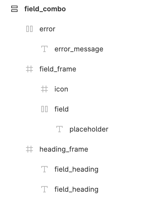
Because it is already an auto layout frame, we can't just right click and select auto layout. Instead, right click and click "Group Selection". Then, right click on your new group and select "Auto Layout". Congrats, you now have an auto layout frame inside another auto layout frame! Let's call this frame "field_combo", and give it's "spacing between items" setting 12px.
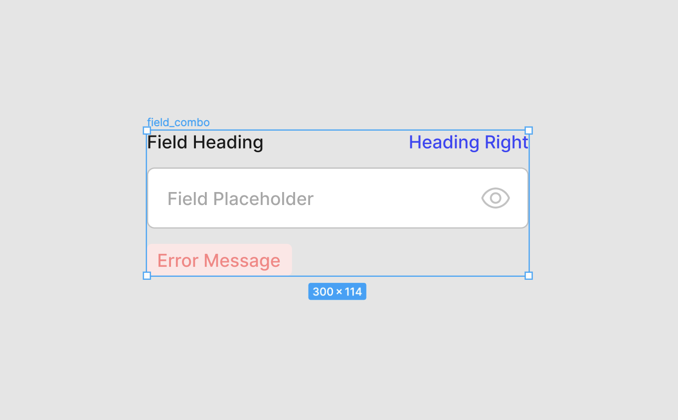
The first element we will add will be the field heading. Inside the "field_combo" frame, simply add your heading text in using the text tool (I'll name this layer "field_heading). For this example we again use the font Inter at the same size, but now with a fill of #1A1A1A. Rearrange this text layer so it is above your "field_frame" frame. All done!
Next, we will be adding a secondary heading that will sit to the right of the main heading. This heading can be used for things like "Forgot Password" links, or character counters. This heading needs to remain on the right side regardless of how wide the field is.
To do this, lets duplicate the first "field_heading" text we just made, select both headings, right click and select "Frame Selection". Now these two text layers are in their own frame. Let's call this frame "heading_frame". Let's set this frame to "Fill container" on the right hand Resizing menu. We then can move the new heading to the right hand side, and give it a "Right" and "Top" set of constraints. Now when we resize the "field_combo" frame, this heading will stay to the right!
Now, let's add an error message and a place for an icon within the field.
For the error message, I added another text item within the "field_combo" frame, with a fill of #FF8282. I then converted it to an auto layout frame, added a fill to that of #FFE7E7, and adjusted the padding to 4px,8px,4px,8px. This gives us a little red error box below the field.
To add the icon to the field, it's a bit more complicated. At the moment, we can't just add an icon into the "field" auto layout frame as we couldn't get it aligned to the right (well.. we could, but it wouldn't work for a responsive design).
Instead, let's follow a different process. Add your icon of choice (here we chose a 24x24px icon with a fill of #C2C2C2) to the "field_combo" frame. Then, select your icon and your "field" frame, right click and select "Frame Selection". We then follow the same process as the field headings by moving the icon to the right, and setting its constraints to "Right" and "Top". We now have an icon that looks like its in the field, and it will stay in position on resize.
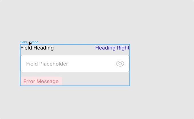
If it all worked out, you should be left with something that looks like the following screenshot! When you change the width of "field_combo", everything should remain in the same position. If not, make sure the correct frames are set to "Fill Container".
Organise those layers
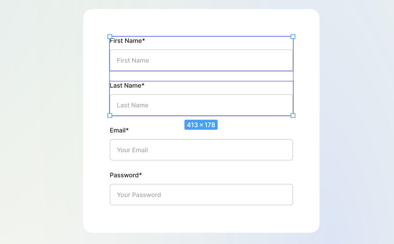
Have a look at this image below as a reference for how your layers should be nested. It's an auto layout frame, with an auto layout and two frame children. Yes, this can get complicated fast!
Let's give it a test!
At this point, try and resizing the "field_combo" frame to see if everything is working correctly. If it's all good, let's continue along.
Step 3: Make it a component
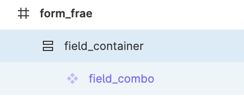
The field is now all done! This will become the basis of all the fields in our form. Select the "field_combo" frame, and select "Create Component". We want it to be a component so we can use and create multiple variations of it in our final form!
The next step from here is to select our new component, right click, "Group Selection", then right click this new group, and select "Add Auto Layout". Yes this is a lot of auto layouts!
This new auto layout frame will be our container for all our fields (and become the box that they are housed in). Let's call this auto layout frame "field_container".
Step 4: Making the form box
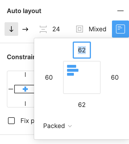
Let's modify what this frame looks like and how it functions. Select your new frame and give it a fill of #FFFFFF. In the Auto layout menu to the right, lets adjust the "Spacing between items" to be 24px, and the padding to be 62px, 60px, 62px, 60px. I'll also set the horizontal constraint to "Center", and add a 20px corner radius.
Step 5: It's all coming together
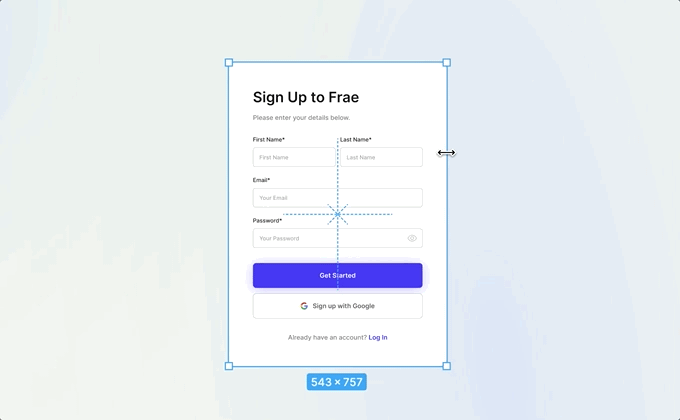
Let's select this "field_container" frame, and set it to a fixed width of 500px for now. We can change this later.
We now should have our "field_combo" frame floating in a nice white box! Let's duplicate this "field_combo" a couple of times to get some more fields in the box (check your auto layout settings to make sure it is set to vertical). At this stage, you can also hide the elements of the field you don't need. I've just kept the left field heading and field itself. I've also moved the "field_container" into another frame just to add a background, this is optional.
Step 6: Start adding multi-column fields
This is all well and good if you want a single column form. But what if you want multiple? Let's duplicate the field one more time so that we have 4 fields.
Make sure your fields stay in their pesky box
Let's select the two fields we want to combine onto one row. Right click and select "Add Auto Layout". Set this new frame to horizontal, "Spacing between items" to 12px, and padding to 0px all the way round. Let's call this new auto layout frame "dual_field". Make sure this is set to "Fill container"
Oh no! Are you feels overflowing outside the box? No worries. Just select each field one at a time and make sure they are also set to "Fill container". We should now have two even sets of fields next to each other! Awesome!
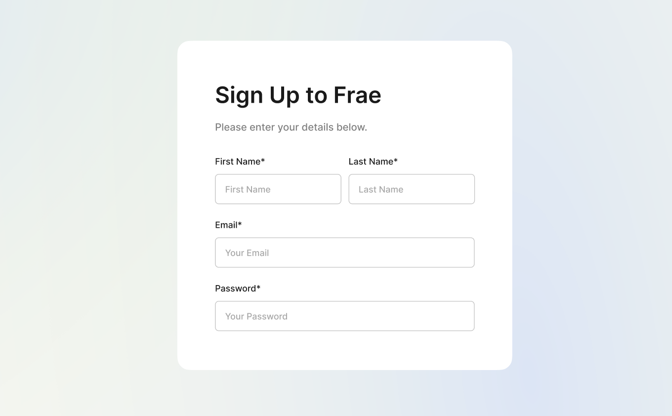
At this stage you can also go through and update your field headings to match the form you would like to create. If you're just following along for this tutorial, feel free to copy the images above and below.

Step 7: Adding some text
The main body of the form is now complete, let's start adding in the other elements to finish it off. Not long to go, I promise!
All you need to do here is add in text to the "field_container" frame, and organise it in the layers panel to be on top. Here I added a 38px Semibold heading, with a 16px Medium subheading filled #808080. I've also added these two text elements to their own autolayout called "form_heading" so I could adjust their "Spacing between items" to 18px, and add 12px of padding below. Without doing this, these two text elements would inherit the 24px spacing of the "field_container" frame.
Step 8: Adding buttons
It's now time for the last step. Let's add in some Sign Up buttons, and a link to Log In.
Just like before, let's add some text to the "field_container" frame. This will be the start of our "Get Started" button. For this text, let's make it 16px, Semibold, and #FFFFFF. We can then right click, "Add auto layout", center align and give it 10px padding all the way round. Set the height to fixed at 62px, and make sure to give the button have horizontal resizing trait of "Fill container"!.
Lastly, let's give it some colour. Select your new "submit_button" frame, and give it a fill of #413DF9. I'll also give it a drop shadow of #6A67FF at 40% opacity, X0, Y4, Blur 40 and Spread 0. This will give us a subtle glow below the button.
To make the google sign up button, we can duplicate the "submit_button" frame, and add both of these buttons to their own - you guessed it - auto layout frame. We will simply call this one "buttons".
This "buttons" auto layout frame will be vertical, and have a spacing of 14px. Adjust the styling of the new button to have a fill of #FFFFFF, 1px stroke of #C2C2C2, and add in the google logo to the button auto layout (I've set this one to horizontal and 12px spacing).
That's the buttons all done, now let's add that last line of text. Add your text in to the "field_container" frame (I just duplicated the "Please enter your details." text for this) and make sure it's in the right position in your layers panel so it is at the bottom of the box. I then created a "log_in" auto layout for this, and added a 14px of top padding to seperate it from the buttons.
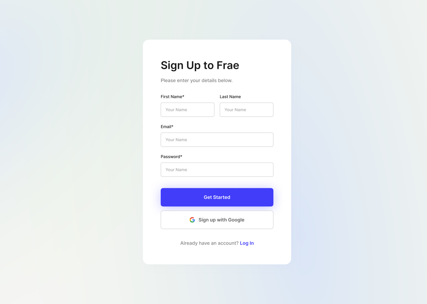
Congrats! You now have a completed form! 🎉
Nice one! It's all done! You can now play around with different layouts and structures, the possibilities are endless. Move things around, add more columns, just see what you can do!
Remember that error message text you designed, and that secondary heading? Feel free to show these elements where needed. You can then alter stroke and text colours for your intended purpose.
What can you do next?
A step further from this process would be creating component variations with each of these different elements, really allowing you to make forms super fast! I'll be creating part 2 to this blog post soon outlining the process, and how you can integrate it into a design system.
Thanks for making it all the way through this tutorial. If you think that someone else may find it useful, be sure to share this page. They will be making forms of their own in no time.
Want to learn more? Get in touch!
Get in touch to discuss what will make your next project a success. Do you instead just want to chat about design, or have a couple questions? No worries, let's chat.
Get in Touch!
Why do design with Figma?
Throughout my 10+ year design career, I've experimented with various tools, each offering its own unique strengths and weaknesses. For me, the key to a great tool is how effectively and quickly it translates my ideas onto the page.
When I switched to Figma, I saw my productivity skyrocket. Features like auto layout in particular have allowed me to recreate past designs much faster and with greater precision. If you’re ready to elevate your design game, give Figma a try by clicking the button below.
Disclaimer: I earn a small commission if you sign up through this link. If you'd like to support my work, click below to get started!